Australian Climate Data used for creating trends by BOM is analysed and dissected. The results show the data to be biased and dirty, even up to 2010 in some stations, making it unfit for predictions or trends.
In many cases the data temperature sequences are strings of duplicates and duplicate sequences which bear no resemblance to observational temperatures.
This data would have been thrown out in many industries such as pharmaceuticals and industrial control, and many of the BOM data handling methologies are unfit for most industries.
Dirty data stations appear to have been used in the network to combat the scarcity of climate stations argument made against the Australian climate network. (Modeling And Pricing Weather-Related Risk, Antonis K. Alexandridis et al)
We use a forensic exploratory software (SAS JMP) to identify fake sequences, but also develop a technique which we show at the end of the blog that spotlights clusters of these sequences in time series data. This technique, as well as Data Mining Bayesian and Decision Tree analysis prove the causality of BOM adjustments creating fake unnatural temperature sequences that no longer function as observational data, making it unfit for trend or prediction analysis.
"These (Climate) research findings contain circular reasoning because in the end the hypothesis is proven with data from which the hypothesis was derived."
Circular Reasoning in Climate Change Research - Jamal Munshi
Before We Start -- The Anomaly Of An Anomaly:
One of the persistent myths in climatology is:
"Note that temperature timeseries are presented as anomalies or departures from the 1961–1990 average because temperature anomalies tend to be more consistent throughout wide areas than actual temperatures." --BOM
This is complete nonsense. Notice the weasel word "tend" which isn't on the NASA web site. Where BOM use weasel words such as "perhaps", "may", "could", "might" or "tend", these are red flags and provide useful investigation areas.
Using an offset value arbitrarily chosen, a 30 year block of average temperatures, does not make them "normal", nor does it give you any more data than you already have.
Plotting deviations from an arbitrarily chosen offset, for a limited network of stations gives you no more insight and it most definitely does not mean you can extend analysis to areas without stations, or make extrapolation any more legitimate, if you haven't taken measurements there.
Averaging temperature anomalies "throughout wide areas" if you only have a few station readings, doesn’t give you any more an accurate picture than averaging straight temperatures.
Think Big, Think Global:
Lets look Annual Global Temperature Anomalies. This is the weapon of choice when creating scare campaigns. It consists of averaging nearly a million temperature anomalies into a single number. (link)
Here it is from the BOM site for 2022.

Data retrieved using the Wayback website consists of the years 2014 and 2010 and 2022 from BOM site (actual data is only to 2020). Nothing is available earlier.
Below is 2010.

Looking at the two graphs you can see differences. There has been warming but by how much?
Overlaying the temperature anomalies for 2010 and 2020 helps.

BOM always state that their adjustments and changes are small, for example:
"The differences between ‘raw’ and ‘homogenised’ datasets are small, and capture the uncertainty in temperature estimates for Australia." -BOM
Let's create a hypothesis: Every few years the temperature is warmed up significantly, at the 95% level (using BOM critical percentages).
Therefore, 2010 > 2014 <2020.
The null hypothesis is that the data is from the same distribution therefore not significantly different.
To test this we use:
Nonparametric Combination Test
For this we use NONPARAMETRIC COMBINATION TEST or NPC. This is a permutation test framework that allows accurate combining of different hypothesis.
Pesarin popularised NPC, but Devin Caughey of MIT has the most up to date and flexible version of the algorithm, written in R. (link).
Devin's paper on this is here.
"Being based on permutation inference, NPC does not require modeling assumptions or asymptotic justifications, only that observations be exchangeable (e.g., randomly assigned) under the global null hypothesis that treatment has no effect. It is possible to combine p-values parametrically, typically under the assumption that the component tests are independent, but nonparametric combination provides a much more general approach that is valid under arbitrary dependence structures." --Devin Caughey, MIT
As mentioned above, the only assumptions we make for NPC are that the observations are exchangeable, and it allows us to combine two or more hypothesis, while accounting for multiplicity, and to get an accurate total p value.
NPC is also used where a large number of contrasts are being investigated such as brain scan labs. (link)
The results of after running NPC in R, and our main result:
2010<2014 results in a p value = 0.0444
This is less than our cutoff of p value = 0.05 so we reject the null and can say that the Global Temp. Anomalies between 2010 and 2014 have had warming increased significantly in the data, and that the distributions are different.
The result of 2020 > 2014 has a p value = 0.1975
We do not reject the null here, so 2014 is not significantly different from 2020.
If we combine p values using hypothesis (2010<2014>2020 ie increases in warming in every version) with NPC we get a p value of 0.0686. This just falls short of our 5% level of significance, so we don't reject the null, although there is considerable evidence supporting this.
The takeaway here is that Global Temperature Anomalies have been significantly altered by warming up, between the years 2010 and 2014, after which they stayed essentially similar.
I See It But I Don't Believe It....
" If you are using averages, on average you will be wrong." (link)
-- Dr. Sam Savage on The Flaw Of Averages
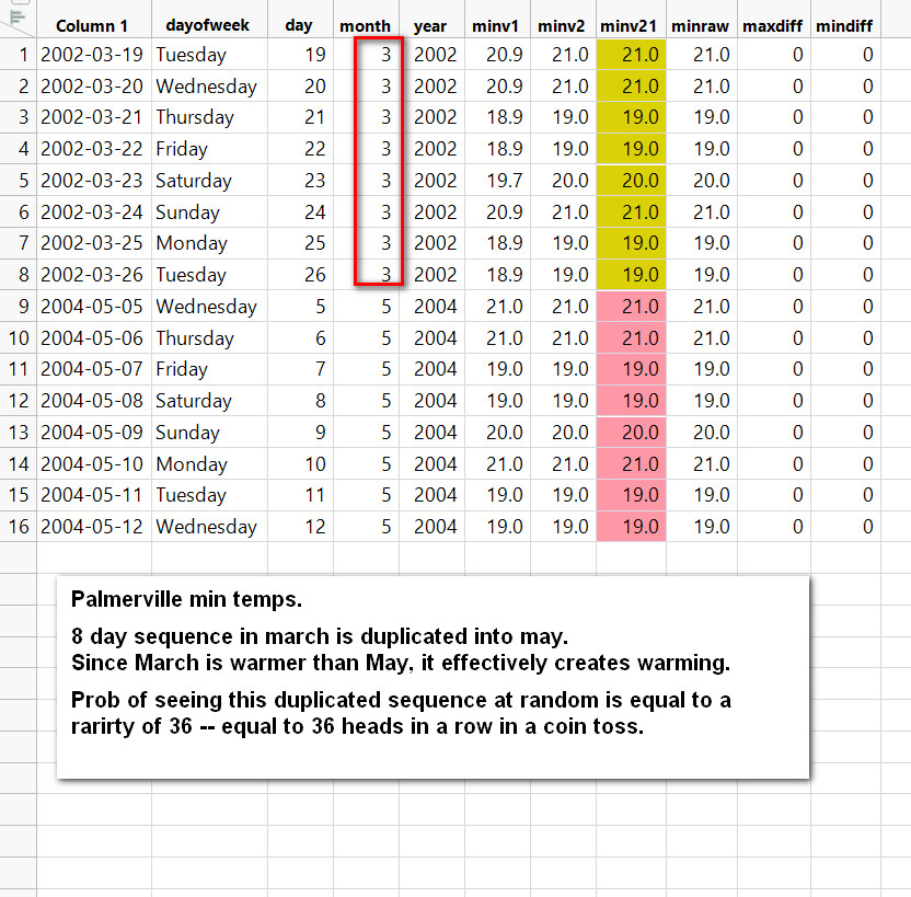
I earlier posts I showed the propensity of the BOM to copy/paste or alter temperature sequences, creating blocks of duplicate temperatures and sequences lasting a few days or weeks or even a full month. They surely wouldn't have done this with Global Temperature Anomalies, a really tiny data set, would they?

As an incredible as it seems, we have a duplicate sequence even in this small sample. SAS JMP calculates the probability of seeing this at random given this sample size and number of unique values, is equal to seeing 10 heads in a row in a coin flip sequence. In other words, unlikely. More likely is the dodgy data hypothesis.
The Case Of The Dog That Did Not Bark
Just as the dog not barking on a specific night was highly relevant to Sherlock Holmes in solving a case, so it is important with us knowing what is not there.
We need to know what variables disappear and also which ones suddenly reappear.
"A study that leaves out data is waving a big red flag. A
decision to include or exclude data sometimes makes all the difference in
the world." -- Standard Deviations, Flawed Assumptions, Tortured Data, and Other Ways to Lie with Statistics, Gary Smith.

This is a summary including missing data from Palmerville as an example. Looking at maximum temps first, the initial data the BOM works with is raw, so minraw has 4301 missing temps, then minv1 followed as the first set of adjustments and now we have 4479 temps missing. Around 178 temps went missing.
A few years later and more tweaks are on the way, thousands of them, and in version minv2 and we now have 3908 temps missing, so now 571 temps have been imputed or infilled.
A few more years later technology has sufficiently advanced for BOM to bring out a new fandangled version, minv2.1 and now we have 3546 temps missing -- a net gain of 362 temps that have been imputed. By version minv22 there are 3571 missing values and so a few more go missing.
Max values tell similar stories as do other temperature time series. Sometimes temps get added in with data imputation, sometimes they are taken out. You would think that if you are going to use advanced techniques for data imputation you would do all the missing values, why only do some. Likewise, why delete specific values from version to version.
Its almost as if the missing/added in values help the hypothesis.
Below -- Lets stay with Palmerville for August. All the Augusts from 1910 to 2020. For this we will use the most basic of all data analysis graphs, the good old scatterplot. This is a data display that shows the relationship between two numerical variables.
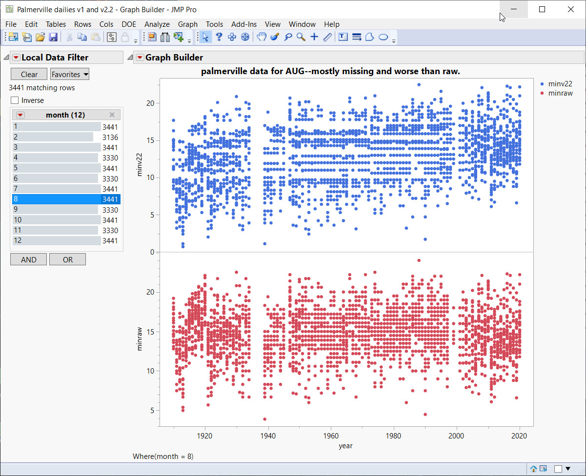
Above -- This is a complete data view of the entire time series, minraw and minv22. Raw came first (bottom in red) so this is our reference. There is clustering at the ends of the raw graph as well as missing values around 1936 or so, and even at 2000 you see horizontal gaps where decimal values have disappeared, so you only get whole integer temps such 15C, 16C and so on.
But minv22 is incredibly bad -- look at the long horizontal "gutters" or corridors that exist from 1940's to 2000 or so. There are complete temperature ranges that are missing, so 14.1, 14,2,14.3 for example might be missing for 60 years or so. It turns out that these "gutters" or missing temperature ranges were added in! Raw has been adjusted 4 times with 4 versions of state of the art BOM software and this is the result - a worse outcome.

January has no clean data, massive "corridors" of missing temperature ranges until 2005 or so. No predictive value here. Raw has a couple of clusters at the ends, but this is useless for the stated BOM goal of observing trends. Again, the data is worse after the adjustments.

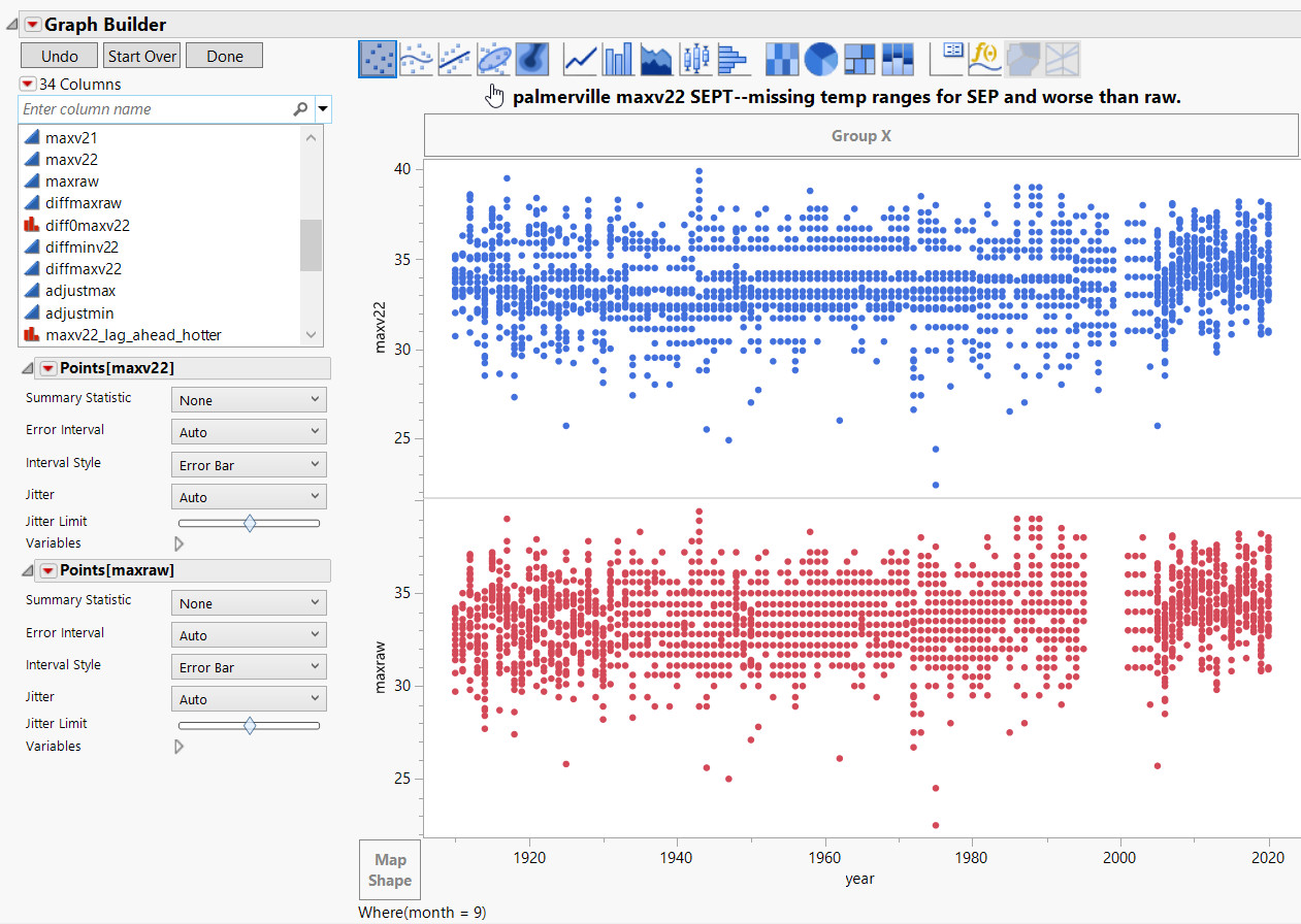
March data is worse after adjustments too. They had a real problem with temperature from around 1998-2005.
Below -- Look at before and after adjustments. This is very bad data handling procedures and it's not random, so don't expect this kind of manipulation to cancel out.
More Decimal Drama:
You can clearly see decimals problems in this histogram. The highest dots represent the most frequently occurring temperatures and they all end in decimal zero. This is from 2000-2020.

Should BOM Adjustments Cause Missing Temperature Ranges?

The data is all still there after adjustment, just the adjusted months were "slightly lowered" indicating a cooler temperature adjustment.

Sunday at Nhill = Missing Data NOT At Random
A bias is created with missing data not at random.(link).
Below - Nhill on a Saturday has a big chunk of data missing in both raw and adjusted.

Below: Now watch this trick -- my hands dont leave my arms -- it becomes Sunday, and voila -- thousands of raw temperatures now exist, but adjusted data is still missing.


The temperatures all reappear!
I know, you want to see more:
Below -- Mildura data Missing NOT At Random

Above -- Mildura on Friday with raw has a slice of missing data at around 1947, which is imputed in the adjusted data.
Below -- Mildura on a Sunday:

Above - The case of the disappearing temperatures, raw and adjusted, around twenty years of data.
Below -- Mildura on a Monday:

Above - On Monday, a big chunk disappears in adjusted data, but strangely the thin stripe at 1947 missing data in raw is filled in at the same location at minv22.
Even major centres like Sydney get affected with missing temperature ranges over virtually the entire time series up to around 2000:

Below -- The missing data forming these gashes is easily seen in a histogram too. Below is November in Sydney with a histogram and scatterplot showing that you can get 60-100 years with some temps virtually never appearing!


More problems with Sydney data. My last posts showed two and a half months of data that was copy/pasted into different years.
This kind of data handling is indicative of many other problems of bias.
Sydney Day-Of-Week effect
Taking all the September months in the Sydney time series from 1910-2020 shows Friday to be at a significantly different temperature than Sunday and Monday.
The chance of seeing this at random is over 1000-1:

Saturday is warmer than Thursday in December too, this is highly significant.

Never On A Sunday.
Moree is one of the best worst stations. It doesn't disappoint with a third of the time series disappearing on a Sunday! But first Monday to Saturday:
Below -- Moree on a Monday to Saturday looks like this. Forty odd years of data is deleted going from raw to minv1, then it reappears again in versions minv2, minv21 and minv22.

Below -- But then Sunday in Moree happens, and a third of the data disappears! (except for a few odd values).

Adjustments create duplicate sequences of data
The duplicated data is created by the BOM with their state-of-the-art adjustment software, they seem to forget that this is supposed to be observational data. Different raw values turn into a sequence of duplicated values in maxv22!

Real Time Data Fiddling In Action:

Maxraw (above) has a run of 6 temperatures at 14.4 (others too above it, but for now we look at this), and at version minv1 the sequence is faithfully copied, at version minv2 the duplicate sequence changes by 0.2 (still dupes though) and a value is dropped off on Sunday 18. By version minv21, the "lost value" is still lost and the duplicate sequence goes down in value by 0.1, then goes up by 0.3 in version minv22. So that single solitary value on Sunday 18 becomes a missing value.
A Sly Way Of Warming:

-- Standard Deviations,Flawed Assumptions, Tortured Data, and Other Ways to Lie with Statistics, Gary Smith.
The Quality Of BOM Raw Data
taken from two or more stations." -- the BOM

You don't have to be a data scientist to see that this is a problem, there appear to be two histograms superimposed. We are looking at maxraw on the X axis and frequency or occurrences on the Y axis.


These histograms consists of the entire time series. Now we know decimalisation came in around the 70's, so this shouldn't happen with the more recent decades, correct?

Here we have what appears to be three histograms merged into one, and that is in the decade 2010-2020. Even at that late stage in the game, BOM is struggling to get clean data.

Adjustments, Or Tweaking Temperatures To Increase Trends.


Look at the intricate overlapping adjustments- the different colours signify different sizes of adjustments in degrees Celsius (see table on right side of graph).


1-- most of the warming trends are created by adjustments, and this is easy to see.
2--BOM tell us that they are crucial because they have so many cases of vegetation growing, moving to airports, observer bias, unknown causes, cases where they think it should be adjusted because it doesn't look right and so on.
The Trend Of The Trend


Adjustments: Month Specific And
Add Outliers + Trends,
The above shows how the largest cooling adjustments at Bourke get hammered into a couple months. This shows months and frequencies, how often adjustments of this size were done. It makes the bias adjustments look like what they are - warming or cooling enhancements.


Adding outliers is a no-no any any data analysis. The fact is that only some values are created, which seem to suit the purpose of warming, but there are still missing values in the time series. As we progress to different versions of tweaking software, it is possible new missing values will be imputed, or other values disappear.

First Digit Of Temperature Anomalies Tracked For 120 years
Technological improvements or climate change? Bayesian modeling of time-varying
conformance to Benford’s Law, Junho Lee and Miquel de Carvalho (link)

The German Tank Problem


The paired days with same temperatures are clustered in the cooler part of the graph, and taper out after 2010 or so.


This data is varying with adjustments, in many cases there are very large difference before and after adjustments.


